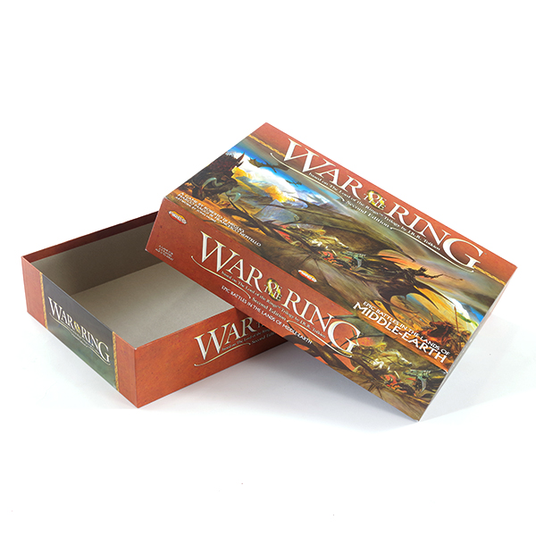
In many cases, the packaging box is a kind of product's outer packaging, which is highly valued by people. Therefore, it is required to be beautiful and elegant to meet people's aesthetic standards. This depends on color planning and distribution, depending on the graphics, and the connotation of the text. Show it. The most important thing is the color of the packaging box. Color is the general tendency of the color equipment on the screen. The general mood is the main color of a group of colors. It has the dominant printing technology in the full screen. The packaging requires long-distance The shelf stands out visually in a moment and conveys product information, which requires a strong sense of color to cooperate with the printing market.
Therefore, the key to packaging color planning is color planning. The requirements of color planning are the same as the main functions of the product, and the requirements of color planning are the same as those of the age, and the preferences of different regions and different nations. The box conforms to the trend of the times.
Moreover, it is the contrast and contrast of colors. Two colors that are opposite each other are called contrast colors. Their hue and brightness are very different, leaving people with a sharp and sharp contrast. The color can only be expressed correctly by contrast. Image printing.
When there is contrast, there is harmony. The two nearby colors are called Harmony Printing. The colors and colors give people a tactful, rich, elegant, pleasant, and comfortable feeling.
Another important aspect of color is rhythm. People often say that music has rhythm. Why does color also have rhythm? Rhythm is an important element in the sense of the way the picture is displayed. There are many changes in the picture, such as strong and weak, light and dark, rigid Softness, true and false, etc., the alternation of these contradictory sides is not a simple repetition, but a rhythmic movement in multiple ways. It has both repetition and expansion. All aspects of the packaging box manufacturers restrict each other and advance each other, reflecting Natural and harmonious printing.
The basic requirement of packaging color planning is to deal with changes and common connections, seeking changes in common, and seeking common in changes, this is the so-called color rhythm.
The color planning of the gift box packaging is very sophisticated. It is not a simple association that can come up with good ideas at once. It requires repeated consideration and a sophisticated grasp of color. To plan the packaging perfectly, it is definitely not an overnight task.
The most important thing in this is its color. The role of color in packaging planning is determined by the reflected light, the color elements distributed around it, and even the viewer’s perspective: each color has a different role and will affect us. Next, the staff of Ching Luen Packaging and Printing Factory will come to see with us the distribution of the six colors in the packaging plan, and what will happen if bumps occur.
1. Red: The color is warm, the character is strong and outgoing, and it is also a very irritating color. The red color simply arouses people's attention, makes people excited, excited, severe, and agitated. At the same time, it also causes visual fatigue.
2. Yellow: indifferent, arrogant, sensitive, yellow, with an expanded visual image, yellow is a delicate color among various colors.
3. Blue: The color feeling is cold, the simple and introverted blue is often the color with vivid personality and strong expansion power, providing a far-reaching, Guangpu, and quiet space, becoming a friendly and modest contrast to vivid colors Friends of, blue is still a color that still seems to be able to maintain a strong personality even after being faded.
4. Green: The two components of yellow and blue are mixed to become green. In green, the expansion of yellow and the shortening of blue are in the meantime. The gift box offsets the warmth of yellow and the coldness of blue, so It makes the green character peaceful and stable, which is a gentle, quiet, and beautiful color.
5. Purple: The lightness of purple is lower among the colorful colors, and the low lightness of purple gives people a sense of depression and mystery.
6. White: White has a bright color, simple, pure, and happy personality. White is pure and non-aggressive. If any other color is added to white, it will affect its purity and make its personality become tactful.
The importance of color for packaging box planning is self-evident, and it also plays an important role in packaging box planning. Good packaging boxes require good color distribution, and color distribution is also a very important knowledge. Different colors are important for people. There are different feelings, here is a reminder to pay attention to the color distribution when choosing a box.

No. 3, Julong Road, Longkou Town,
Heshan City, Guangdong, China
Phone: (750)8732888 Fax: (750)8732882
sales@chingluen.com
