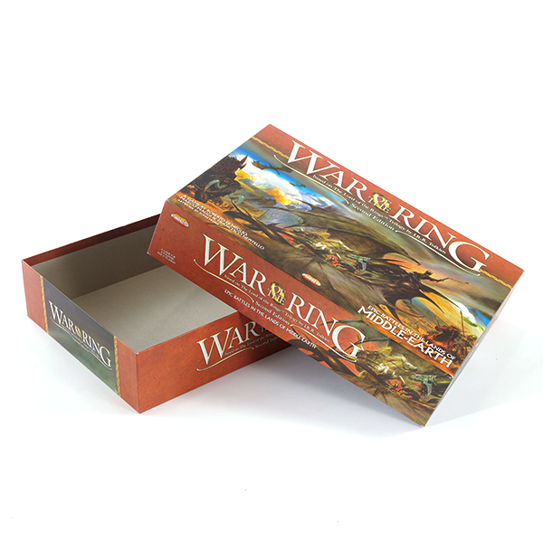
The color design of the color box packaging is attached to the graphics, text and muscles. It not only requires beauty, generosity, and meets people's aesthetic requirements, but also should be highly coordinated with people's psychological feelings. The color design of color box packaging and printing mainly considers the printing market from the following aspects.
Hue is the general tendency and general sentiment of the color configuration on the screen. It is the main color of a group of colors, and it is the dominant printing technology in the full screen. Packaging requires a momentary visual prominence on the long-distance shelf to convey product information, which requires a strong overall sense of color to match the printing market. Therefore, the key to the color box packaging design is the color design equipment consumables. The color design requirements are consistent with the main functions of the product. For example, red tone should be used for gift packaging, and cold tone printing technology should be used for cold drink packaging. The hue design requirements should be consistent with the times, with the preferences of different regions and different ethnic groups. It must be able to adapt to this change and conform to the trend of the times. For example, people in Islamic dioceses prefer green and avoid yellow; Tibetans use white as a noble color. Use light yellow and green; Manchus love yellow, purple, red, blue and avoid using white and other materials. Tone design should fully consider these traditional habits in order to make the product popular. For export commodities, packaging design can only respect the custom printing market of other countries or nationalities.
In the twelve-hue circle, two similar colors are called the harmonic color printing tools. The color harmony gives people a subtle, rich, elegant, pleasant and comfortable feeling. The main blending methods are: the same color tone refers to the color combination of the same color but different brightness, such as the combination of light green, bright green, and dark green or the printing of light red, red, and dark red. Approximate hue sum refers to the combination of different colors that contain common components. For example, orange, vermilion, and yellow all contain yellow components, and they are easy to harmonize printing technology.
Ching Luen Packaging and Printing Factory provides personalized customization, a variety of material options, and a variety of box types to create a box type that meets your product positioning.

No. 3, Julong Road, Longkou Town,
Heshan City, Guangdong, China
Phone: (750)8732888 Fax: (750)8732882
sales@chingluen.com
